Let’s be honest for a second. Most of us have stood in front of the mirror at 7:42 am, coffee going cold, thinking : “Why does this outfit look… wrong ?” The cut is fine. The size is right. But the colors ? Something’s off. And no, it’s not just in your head. Color matching is usually the silent culprit. The good news ? You don’t need a fashion degree or a Pantone chart taped to your wall to get it right.
Color is emotional. It’s visual. And it’s brutally honest. Get it right, people notice (even if they don’t know why). Get it wrong, and you feel it all day. Shoulders tense, confidence a bit lower. Been there, trust me.
Second thing before we dive in : if you ever want to go deeper than quick rules and really understand what works for you, I’ve found some solid, practical advice over at https://relookingconseil.com. No fluff, just real guidance. Anyway, back to outfits.
Start simple : fewer colors, fewer mistakes
This is probably the most underrated rule, and frankly the most effective. Stick to two or three colors max in an outfit. Not five. Not seven “because they’re all muted”. Two or three.
A classic combo ? Navy, white, and brown. That’s it. Works in London, works in Manchester, works everywhere. When people say someone looks “well dressed but effortless”, nine times out of ten, that’s what’s happening.
Personally, every time I try to add a fourth color, I regret it. Maybe you’re different, but for most of us, restraint looks better than creativity gone wild.
Neutrals are your safety net (use them)
If color matching feels stressful, neutrals are your best friends. Black, white, grey, beige, navy, camel. They don’t argue with anyone. They just… cooperate.
Think about a grey wool coat on a cold morning. You can throw almost anything under it : burgundy knit, olive sweater, cream scarf. It just works. That’s not magic, it’s neutrality.
A small tip I learned the hard way : not all neutrals feel the same. Black can look harsh in daylight. Navy feels softer. Beige feels warmer. If black makes you look tired, it’s not you. It’s the color.
The color wheel (yes, it actually helps)
I know, sounds a bit textbook. But stay with me. You don’t need to memorize it. Just remember this :
Colors next to each other match easily.
Blue + green. Red + orange. Beige + brown.
These are low-risk combos. They feel natural because that’s how our eyes are used to seeing color transitions. Forests, skies, sunsets. Nature does the work for you.
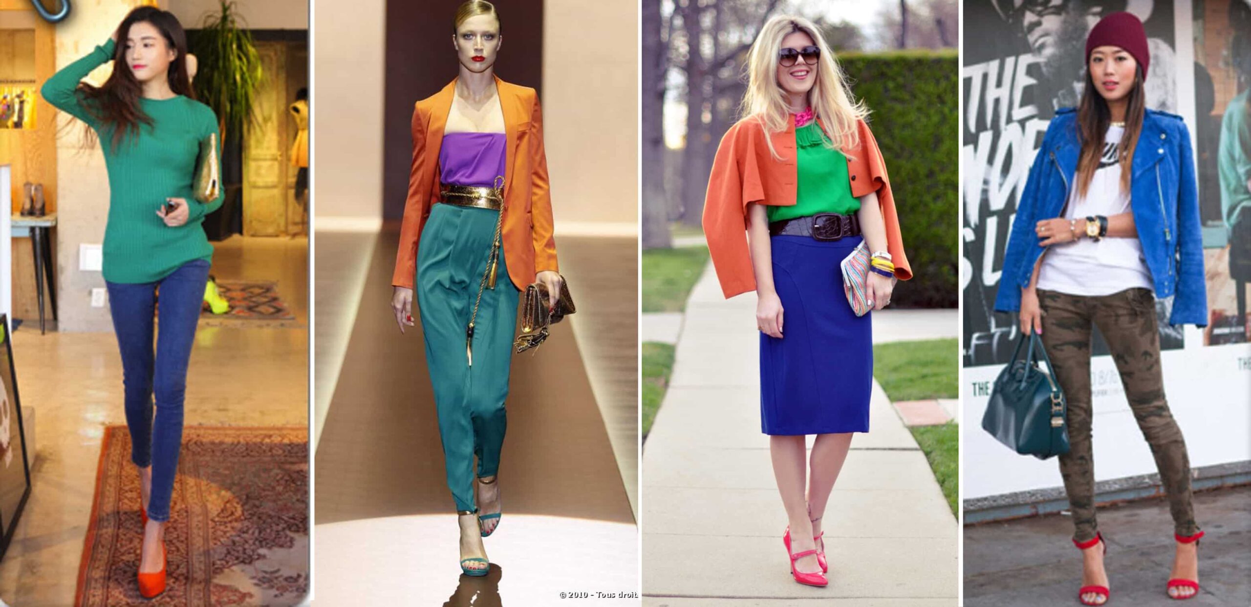
Opposite colors ? That’s trickier. Blue and orange. Purple and yellow. They can look amazing… or awful. The key is balance. One loud color, one calmer version. Bright blue jacket ? Go for a muted, dusty orange accessory. Not neon. Never neon. Please.
One strong color is enough. Really.
This is where people go wrong most often. They find a bold piece they love and then try to “support” it with another bold piece. Big mistake.
If you’re wearing a strong color (say, emerald green trousers), everything else should calm down. Grey knit. White shirt. Brown shoes. Let the green breathe.
I once saw someone on the Tube wearing a bright red coat, cobalt blue scarf, and yellow trainers. Technically bold. Visually exhausting. You don’t want your outfit to shout from across the street.
Watch the contrast (especially near your face)
This one matters more than people think. High contrast near the face (black and white, for example) draws attention. Low contrast (beige on cream) feels softer.
If you’ve got strong features or dark hair, contrast can look fantastic. If you’re fair, low contrast often feels more natural. Not a rule carved in stone, but a solid guideline.
Next time you try on a top, ask yourself : does this color make my face pop, or does it wash me out ? You’ll know instantly. Your mirror doesn’t lie.
Patterns don’t excuse bad color choices
Quick reality check : patterns don’t magically solve color issues. A patterned shirt with six colors is still six colors. The trick ? Pull one color from the pattern and repeat it elsewhere.
Floral shirt with navy in it ? Navy trousers. Done. Striped jumper with beige lines ? Beige chinos. Simple. When patterns feel “too much”, it’s usually because nothing is anchoring them.
Trust your gut (but test it)
Sometimes, something breaks all the rules and still works. Fashion is like that. But here’s the thing : people who pull that off usually understand the rules first.
If you’re unsure, take a quick photo of your outfit. Weird tip, but it works. Photos flatten colors and make clashes obvious. What felt “interesting” in the mirror might look messy on screen.
And ask yourself : would I feel comfortable walking into a café full of people dressed like this ? If the answer is “maybe…”, tweak one thing.
Final thought : harmony beats originality
You don’t need to dress louder than everyone else. You need to dress cleaner, more intentional. Harmonious colors make clothes look better, more expensive, more you.
Honestly, when colors work, everything else feels easier. You stand straighter. You stop adjusting your sleeves. You forget about your outfit and get on with your day. That’s the goal.
So tomorrow morning, when you’re half-awake and staring at your wardrobe, remember : fewer colors, calm neutrals, one strong piece. And trust yourself. You’re probably closer to getting it right than you think.